
Pantone, Politics, and Peace Prizes
A couple of items before we jump into things.
Farewell, 2025 – this will be the last issue of Godspeed until the first of the year. I’m going to take a powder over the holidays and hope you are able to take time off as well.
Second, I’m experimenting with a slightly different format today.
Now, let’s go!
What Would Walter White Say?

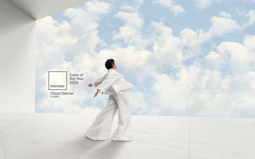
Just like this meme with Walter White of Breaking Bad, a lot of people are saying, “No – hell, no!” to Pantone’s selection of a white hue it's branded "Ghost Dancer" as 2026 Color of the Year.
I’m saying, “Yes – hell, yes!”
But that wasn’t my first reaction.
My initial hesitation was political – it hit me that at this point in time, with the anti-DEI power grabs of the federal government and attendant corporate CEO suck-ups disavowing their diversity and sustainability programs, the last color we need to celebrate is white.
Then it hit me: There’s no reason to politicize a color spectrum with such a broad and nasty brush.
And just as with the American flag and those who have tried to take it away from all of us, there’s no reason to let those who would like to possess and promote the color white – in distasteful ways – take it away from us.
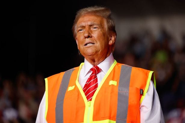
After all, I haven’t let “you know who” take the color orange, my lifelong favorite, away from me.
I'm also a card-carrying member of the Cloud Appreciation Society, so be forewarned: You can take the billowy white of a summer's Cumulus cloud away from me when you pry it from my cold, dead hands.
So, I got over that internal disquiet for a quiet color choice.
On the pure design front, many online onlookers registered this choice as insipid, ho-hum, you might say, “vanilla.”
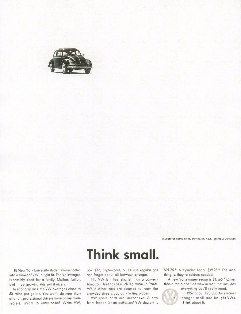
For me, it’s a brave choice with a strong rationale, "a whisper of peace and tranquility in a noisy world." After all, in design it’s the absence of color – aka my design bestie, “white space” – that enables colors to stand out, that allows a message to break through. Even if the only color is black, as in this classic print ad.
The full rationale is worth a read and, as I said, a daring choice. Oh, and wouldn't it have been fun to have been in the conference room when the folks at Pantone made this decision to hear what I'm sure was one helluva conversation?
What do you think?
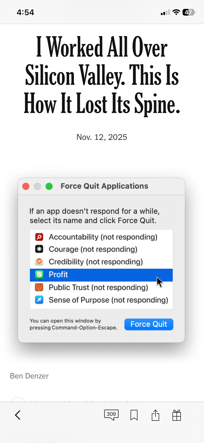
The Spineless Creatures of Silicon Valley
A great op-ed piece in the New York Times by Aaron Zamost, though what I'd really like to celebrate is the fantastic "force quit" graphic created by Ben Denzer to accompany the piece. ⬇️
Not Everyone Peacocks For The Prize
While a certain politician peacocks for the prize, it’s given me occasion to contemplate the Nobel Peace Prize and what should qualify a human to be awarded this honor – thinking about what that person sounds like, specifically, the actual words of an honest-to-goodness Nobel Peace Prize candidate. Here’s what they sound like to me, even if this these words are from one who actually refused the nomination:
"I feel that the dormant goodwill in people needs to be stirred. People need to hear that it makes sense to behave decently or to help others, to place common interests above their own, to respect the elementary rules of coexistence." Vaclav Havel
This One’s Dynamite
Let’s keep with that Nobel Prize thread for a bit, with a nod to Alfred Nobel, the Swedish inventor of dynamite and a peace prize for mastering the art of lifetime accomplishment juxtaposition.
I’ve written about Ecosia before – The Little Search Engine Who Could. It’s a small German company (and Certified B Corp) that punches way above its weight in the world of environmental impact, specifically climate impact. It’s now launching what it’s calling the Climate Nobel Prize, which it has endowed with €1 million for the winner. Ecosia makes its money, and impact, by generating search engine advertising revenues. It’s easy to install and delivers great results. I’ve been using it for years – I can’t recommend it highly enough, so go ahead and get it here.
There’s a New Front in the War on Fonts
I know many readers are fans of branding and design, so let’s peek into the design dossiers of the U.S. Government.
Awhile back I posted an estimate that it could cost $1 billion to rebrand the Department of Defense to the Department of War. Turns out it's estimated to be twice that amount. 🤨
The State Department has announced it will boomerang its official font from Calibri back to Times New Roman. (In 2023, Calibri replaced Times New Roman as the official font because its design is deemed to be more accessible to users, particularly those using Optical Character Resolution or screen readers.)
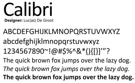
In making the announcement, Secretary of State Marco Rubio complained that the move to Calibri was a radical DEI and accessibility initiative.
Leaving us to ask:
- When will the madness stop?
- How much does the madness cost?
- And can Zaph Dingbats or Comic Sans be far behind as the new fonts for the White House?
Getting Greeky and Geeky
Now let’s veer back to something positive, a word offered up by reader Paul Miles in response to last week’s issue (Good Gravy! A Word Nerd’s Alternative “Best of” List).
Paul wrote, “Here is my favorite word, kairos, defined uniquely by the Presbyterian theologian Robert MacAfee Brown as ‘moments in time that give meaning to the rest of time.’”
Kairos. Now there’s a word. Thanks for the moment, Paul 🙏.
The Kids Are All Right
We've been following the efforts of Montana youth to fight climate change (Showdown at the Climate Corral) in the courts. They won a landmark decision in 2023 – and are now battling the state legislature's attempt to end-around that decision.
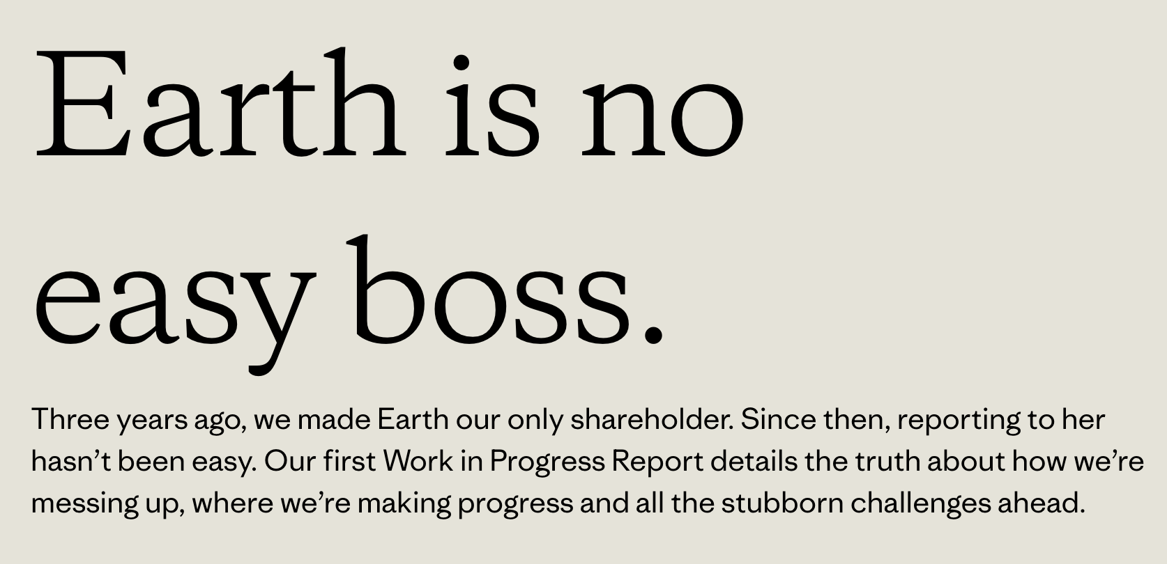
Patagonia Releases Its First-Ever Impact Report
Calling it a “Work in Progress,” Patagonia’s report was praised by many for its brutal honesty and depth of detail while also generating its share of commentary from haters. Patagonia responded in hilarious form to its “fan mail” with videos from employees responding to critiques. You can see the videos here (scroll down when you land on the page) and can download the impact report here.
A Song for You
Actually, two songs – just to remind you of how a "cover" can be as uniquely its own as was the original. First, Sturgill Simpson with his cover of "Bloom" by Nirvana, followed by "three fine men from Seattle" playing the original.
How about you? Feel like sharing one of your favorite covers?
Sayonara
That’s it for 2025. I’ll leave you with a heartfelt wish that you find some peace, hope, and joy this holiday season – and perhaps even some shared space with Ghost Dancer and its attributes.
2026 is just around the bend and there’s plenty of work to be done.
Godspeed, friends.
Russ